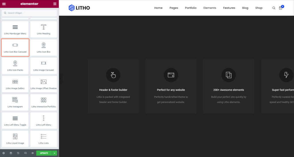
Litho Icon Box Carousel widget allows you to create a slider of images, media, and text.
Content
Icon Box
| Carousel items | Add carousel items by clicking “+”sign |
Settings
| Icon view | Choose between different icon view styles |
| Image size | Set the image size from the available different sizes |
| Title HTML tag | Set the HTML tag of the title as H1…H6, div, span or paragraph |
Slider Configuration
| Slides to show | Select the number of slides to show at one time, from 1 to 10, default or auto |
| Items spacing | Set the spacing between the image and the content |
| Navigation | Set the navigation for the slider as dots and arrows |
| Pause on hover | Check “yes” to add pause effect hover |
| Autoplay | Check “yes” to show autoplay on the slider |
| Autoplay speed | Set the time between each slide. This time is in milliseconds, so 1000 ms is equal to 1 second |
| Infinite loop | Show the carousel in a continuous loop, infinitely. Yes or No |
| Animation speed | Set the time it takes for the animation speed to appear |
| RTL | Set the slider direction from right to left |
| Cursor | Set the cursor visuals as black, white, or default |
Style
General
| Alignment | Align the text to the left, right, center, or justified |
| Hover animation | Set the hover animation from the available for the icon box |
| Transition duration | Set the duration for the transition |
| Background type | Set background type as a classic or gradient |
| Border type | Set a border to the entire box |
| Border radius | Set the border radius for the box |
| Padding | Set the amount of padding |
| Margin | Set the margin for the feature box |
| Box shadow | Set the shadow for the box |
Icon
| Icon color | Set the icon color from the solid or gradient |
| Size | Set the icon size |
| Rotate | Set the rotation for the icon |
| Box shadow | Set the shadow for the icon box |
Image
| Width | Set the width for the image |
| CSS filter | Apply CSS filter for the image |
| Opacity | Set the opacity for the image |
Content
| Typography (Title) | Set the typography for the title |
| Color (Title) | Set the color for the title |
| Spacing (Title) | Set the spacing of the title |
| Display (Title) | Choose different available display styles |
| Typography (Description) | Set the typography for the description |
| Content width (Description) | Set the content width for the description |
| Color (Description) | Set the color of the description |
| Link color (Description) | Set the link color for the description |
| Display (Description) | Set the display from the different available styles |
Navigation
| Position | Set the dots position as a inside or outside |
| Spacing | Set the spacing between dots |
| Size | Set the size for the dots |
| Color | Set the color for the dots |
| Border type | Set the border type for the arrow |
| Margin | Set the margin for the dots |
Advanced
Click here to set the advanced options that are applied to this widget.

