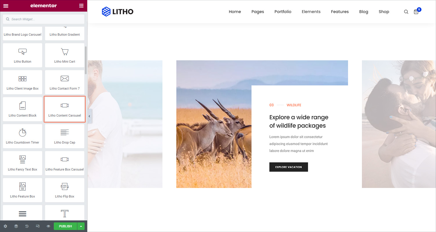
The Litho Content Carousel widget lets you display a sliding carousel of content with media in a variety of designs.
Content
Slider
| Select style | Choose the best style for the slider |
| Carousel items | Add items by clicking on the “+” sign |
| HTML tag | Set the HTML tag of the title as H1…H6, div, span or paragraph |
Slider Configuration
| Image size | Set the image size for the slider |
| Slides to show | Add a number of sliders to show |
| Image stretch | Check “yes” for image stretching in the slider |
| Navigation | Choose slider navigation from dots, arrows, none, and arrows and dots |
| Pause on hover | Make the slide pause when the mouse hovers over it |
| Center slide | Set the center slide for the slider |
| Autoplay | Get the slides to rotate automatically, according to the speed you set |
| Autoplay speed | Set the time it takes for the slide to start rotating |
| Infinite loop | Have the slides rotate in an infinite loop and without stopping |
| Animation speed | Set the time it takes for the slides to rotate |
| RTL | Choose a direction for the slider as left or right |
| Cursor | Set the cursor as a white, black, or default for the slider |
Style
General
| Padding | Set the inner spacing between the edge of the content and the edge of the slide |
Slides
| Text align | Align the text to the right, left or center |
| Background type | Set the background type for the slide as a classic or gradient |
| Border radius | Set the border radius for the slide |
| Border type | Set the border type for the slide |
| Padding | Set the inner spacing between the edge of the content and the edge of the slide |
Note: If an individual slide has Custom styles set, these global styles will have no effect upon that slide.
Icon or Image
Icon
| View | Choose between default, stacked or framed |
| Size | Increase or decrease the size of the icon |
| Color type (Normal/Hover) | Choose the color (the background or frame) color for the icon |
| Padding | Set the padding around the icon to control the size of the stack or frame |
| Margin | Set the margin for an icon |
Image
| Image size | Choose the size of the image |
| Width | Set the Image Width |
| Height | Set the Image height |
| Spacing | Set the spacing for the image |
| Box shadow | Set Box Shadow: Horizontal, Vertical, Blur, and Spread |
| Border type | Set a Border Type |
| Border radius | Set a Border Radius |
Title
| Spacing | Set the spacing between the title and subtitle |
| Text color | Set the color of the title |
| Typography | Set the typography of the title |
Subtitle
| Spacing | Set the spacing between the subtitle and the description |
| Text color | Set the color of the subtitle |
| Typography | Set the typography of the subtitle |
Description
| Spacing | Set the spacing between the description and the button |
| Text color | Set the color of the description |
| Typography | Set the typography of the description |
| Width | Set the width of the description |
Button(Normal/Hover)
| Size | Set the size of the button, from extra small to extra large |
| Typography | Set the typography of the button |
| Text shadow | Set the text-shadow of the button |
| Text color | Set the text color for the button |
| Background type | Set the background for the button |
| Border radius | Set the border radius, to control corner roundness |
| Hover animation | Set the animation for the hover |
| Transition duration | Set the duration for the transition effect |
| Border type | Set the border type for the button |
| Box shadow | Set the box shadow for the button |
| Padding | Set the inner spacing between the edge of the content and the edge of the slide |
| Icon position | Set the icon position for the button |
| Spacing | Set the spacing for the button |
Navigation(Normal/Hover)
| Text color | Set the color for the text |
| Background type | Set the background type for the navigation |
| Position | Set the position of the dots inside or outside the slider |
| Size | Set the exact size of the dots |
| Spacing | Set the spacing of the dots |
| Color | Set the color of the dots |
Advanced
Click here to set the advanced options that are applied to this widget.