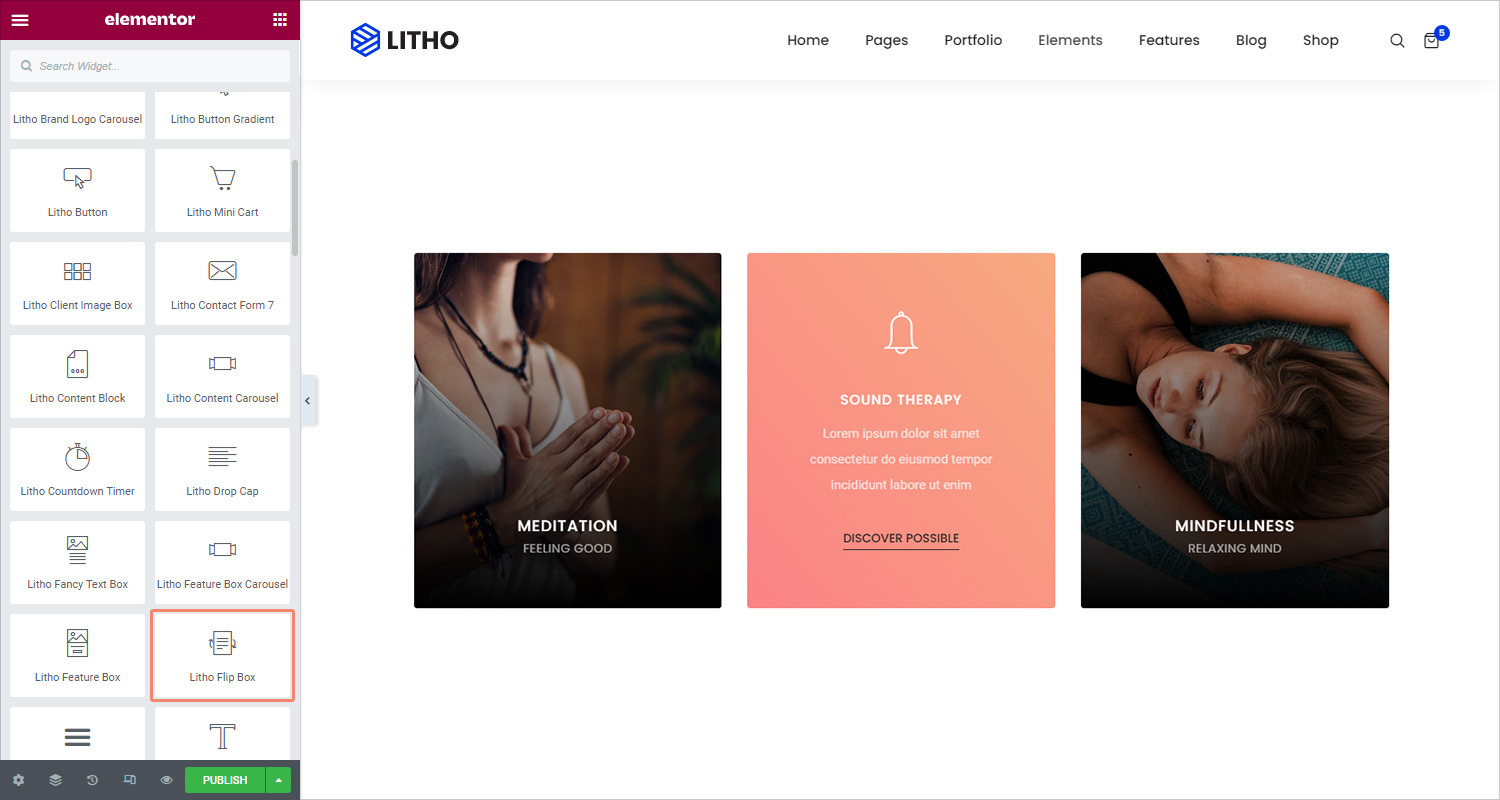
The Litho Flip Box Widget helps you create animated boxes that flip to the other side, once the visitor hovers over them.
Content
Front Side
| Title (Content) | Choose the title and description that appears in the front of the flip box |
| Subtitle (Content) | Choose the subtitle and description that appears in the front of the flip box |
| Content (Content) | Add content in blank space |
| Background type (Background) | Choose Color, Image or Gradient as the background of the front of the flip box. |
Back Side
| Select icon type (Content) | Select or upload SVG an icon from the library |
| Choose icon (Content) | Select an icon from the library |
| View (Content) | Choose the default icon view, or select Stacked or Framed |
| Title (Content) | Choose the title and description that appears in the back of the flip box |
| Subtitle (Content) | Choose the subtitle and description that appears in the back of the flip box |
| Content (Content) | Add content in blank space |
| Text (Content) | Choose the text that appears inside the button |
| Link (Content) | Choose where the button points to. The link needs to include the entire URL (including http / https) |
| Size (Content) | Set the size of the icon from extra small to extra large. |
| Background type (Background) | Choose Color, Image or Gradient as the background of the front of the flip box. |
Settings
| Flip effect | Choose between flip effects, including flip, slide, push, zoom in, zoom out or fade |
| Flip direction | If you choose the flip or slide effects, you can have the flip box flip right, left, up or down |
| 3D depth | Slide to On to give the flip box a 3D animation effect |
Style
General
| Height | Control the height of the flip box |
| Border radius | Set the border radius of the flip box, and make its corners round |
Front Side
| Text alignment | Choose to align the flip box content to the left, right or center of the flip box |
| Vertical alignment | Align the flip box content to the top, center or bottom of the flip box |
| Border type | Set a border to the entire flip box |
| Padding | Set the amount of padding around the icon |
| Box shadow | Set the amount of box shadow around the icon |
| Color (Title) | Choose the color of the title |
| Typography (Title) | Set the typography settings of the title |
| Spacing (Title) | Control the space between the title and description |
| Color (Subtitle) | Choose the color of the subtitle |
| Typography (Subtitle) | Set the typography settings of the subtitle |
| Spacing (Subtitle) | Control the space between the subtitle and description |
| Color (Description) | Choose the color of the description |
| Typography (Description) | Set the typography settings of the description |
| Spacing (Description) | Control the spacing for description |
Back Side
| Text alignment | Choose to align the flip box content to the left, right or center of the flip box |
| Horizontal alignment | Align the flip box content to the right, center or left of the flip box |
| Border type | Set a border to the entire flip box |
| Padding | Set the amount of padding around the icon |
| Box shadow | Set the amount of box shadow around the icon |
| Spacing (Icon/image) | Control the space between the image and the title |
| Primary color | Choose the text color of the icon |
| Icon size | Choose the size of the icon |
| Icon rotate | Rotate the icon to any angle |
| Color (Title) | Choose the color of the title |
| Typography (Title) | Set the typography settings of the title |
| Spacing (Title) | Control the space between the title and description |
| Color (Subtitle) | Choose the color of the subtitle |
| Typography (Subtitle) | Set the typography settings of the subtitle |
| Spacing (Subtitle) | Control the space between the subtitle and description |
| Color (Description) | Choose the color of the description |
| Typography (Description) | Set the typography settings of the description |
| Spacing (Description) | Control the spacing for description |
| Typography (Button) | Customize the typography of the button text |
| Text shadow (Button) | Set the shadow for the button text |
| Text color (Button) | Choose the text color of the button |
| Background type (Button) | Choose the color of the button background |
| Border radius (Button) | Control the border radius of the button |
| Border type | Set a border to the button |
| Box shadow | Set the shadow for the button box |
| Padding | Set the amount of padding around the icon |
Advanced
Click here to set the advanced options that are applied to this widget.