The Button Widget helps you easily design and customize buttons without the need for any other plugins or shortcodes.
Content
Button
| Type | Select from 5 styles of buttons to begin your design. Choose from Default, Info, Success, Warning, or Danger |
| Text | Enter the button’s text |
| Link | Set the URL for the button’s link. Click the cog to set the link to either open in a new window or to add rel=nofollow to the link |
| Alignment | Align the button to the left, center, right, or justified in relation to its column |
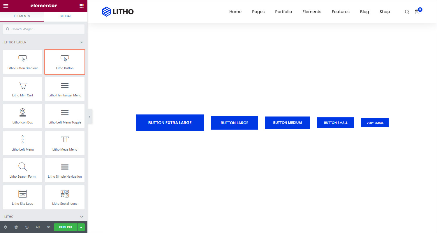
| Size | Select the preset button sizes, from extra small to extra large (see padding default details at the bottom of this document) |
| Width | Control the thickness of the border around the button |
| Height | Control the height of the button |
| Icon | Select from the library or upload SVG icon to display on the button |
| Icon spacing | Adjust the amount of space between the icon and the button text |
| Button ID | Assign a unique button ID to use for situations such as Google Analytics events |
Style
Button(Normal/Hover)
| Typography | Change the default typography options for the button’s text |
| Text shadow | Add a shadow and blur to the button’s text |
| Color type | Select the color type of the button’s text |
| Background type | Select the button’s background color for both normal and hover states. You may use a classic or gradient color |
| Box shadow | Set options to apply a box-shadow on the button |
| Border color | Set the color for the border |
| Border radius | Set the border radius to control corner roundness |
| Hover animation | Set the different animation effects for the hover |
| Transition duration | Set the duration for the transition effect for the hover |
| Border type | Select the type of border to use around the button |
| Padding | Change the padding settings of the button |
Button Preset Sizes: Padding Defaults
Top, Left, Bottom, Right
Extra Small: 10px, 20px, 10px, 20px
Small: 12px, 24px, 12px, 24px
Medium: 15px, 30px, 15px, 30px
Large: 20px, 40px, 20px, 40px
Extra Large: 25px, 50px, 25px, 50px
Advanced
Click here to set the advanced options that are applied to this widget.