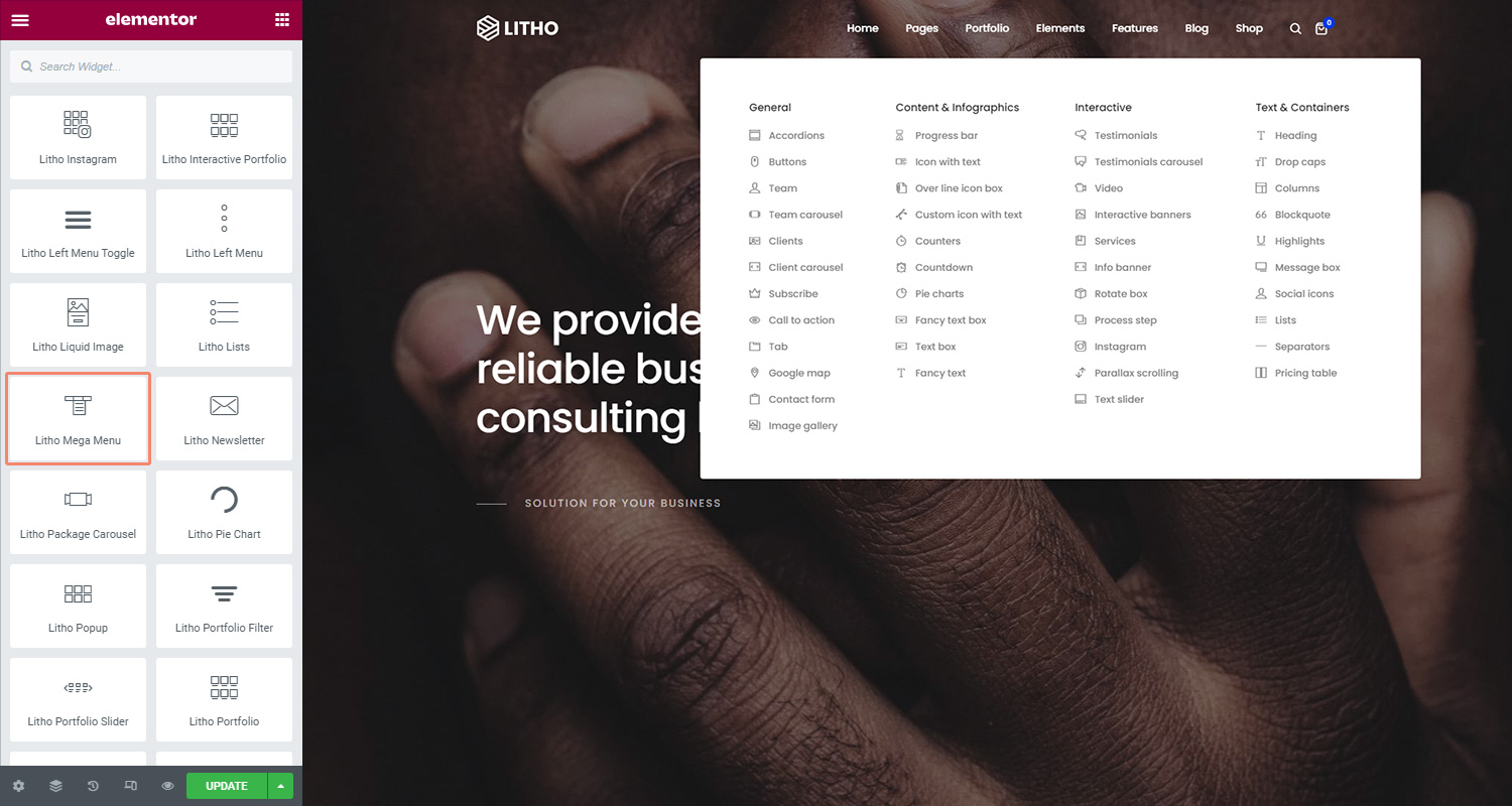
The Litho Mega Menu widget lets you use menus that you’ve created in WordPress and design them in whatever way you want.
Content
Menu
| Select menu | Choose Mega menu style from the different styles |
| Toggle | If you want to use toggle in mega menu, click on “yes” |
Style
Menu Container
| Alignment | Align the menu container to the left, right, center or justify |
| Background type | Set the background type for the menu container |
| Border type | Set the border type from different available types |
| Border radius | Set the border radius to control corner roundness |
| Padding | Change the padding settings of the widget container |
| Box shadow | Set the box shadow for the menu container |
Top Level
| Typography | Change the typography options for the text |
| Text color | Choose the color of the text |
| Text shadow | Set the text shadow for the menu |
| Icon color | Choose the color of the icon |
| Background type | Set the background type for the top level container |
| Border type | Set the border type for the top level container |
| Border radius | Set the border radius to control corner roundness |
| Padding | Set the padding settings |
| Margin | Set the margin settings |
2nd Level (Simple Submenu)
| Typography | Change the typography options for the text |
| Text color | Choose the color of the text |
| Text shadow | Set the text shadow for the menu |
| Icon color | Choose the color of the icon |
| Background type | Set the background type for the 2nd level |
| Border type | Set the border type for the 2nd level |
| Border radius | Set the border radius to control corner roundness |
| Padding | Set the padding settings |
| Margin | Set the margin settings |
2nd Level (Mega Submenu)
| Background type | Set the background type for the 2nd level |
| Border type | Set the border type for the 2nd level |
| Border radius | Set the border radius to control corner roundness |
| Padding | Set the padding settings |
| Margin | Set the margin settings |
| Box shadow | Set the box shadow for the menu container |
| Typography (Submenu title) | Change the typography options for the text |
| Color (Submenu title) | Choose the color of the text |
| Text shadow (Submenu title) | Set the text shadow for the menu |
| Border type (Submenu title) | Set the border type for the 2nd level |
| Padding (Submenu title) | Set the padding settings |
| Margin (Submenu title) | Set the margin settings |
| Typography (Submenu items) | Change the typography options for the text |
| Text color (Submenu items) | Choose the color of the text |
| Text shadow (Submenu items) | Set the text shadow for the menu |
| Icon color (Submenu items) | Choose the color of the icon |
| Background type (Submenu items) | Set the background type for the 2nd level |
| Border type (Submenu items) | Set the border type for the 2nd level |
| Border radius (Submenu items) | Set the border radius to control corner roundness |
| Padding (Submenu items) | Set the padding settings |
| Margin (Submenu items) | Set the margin settings |
3rd Level
| Typography | Change the typography options for the text |
| Text color | Choose the color of the text |
| Text shadow | Set the text shadow for the menu |
| Icon color | Choose the color of the icon |
| Background type | Set the background type for the top level container |
| Border type | Set the border type for the top level container |
| Border radius | Set the border radius to control corner roundness |
| Padding | Set the padding settings |
| Margin | Set the margin settings |
| Box shadow | Set the box shadow for the menu container |
4th Level
| Typography | Change the typography options for the text |
| Text color | Choose the color of the text |
| Text shadow | Set the text shadow for the menu |
| Icon color | Choose the color of the icon |
| Background type | Set the background type for the top level container |
| Border type | Set the border type for the top level container |
| Border radius | Set the border radius to control corner roundness |
| Padding | Set the padding settings |
| Margin | Set the margin settings |
| Box shadow | Set the box shadow for the menu container |
Icon
| Icon Size | Set the size of an icon |
| Margin | Set the margin settings for an icon |
Mobile Menu
| Toggle color | Set the color for the toggle |
| Margin | Set the margin settings |
Advanced
Click here to set the advanced options that are applied to this widget.