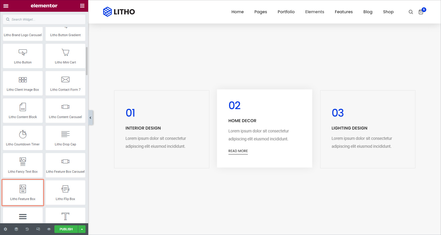
Content
General
| Style | Set the different styles for the feature box |
Icon or Image
| Use images? | Click on “yes” to use images |
| Icon | Add or upload icons from the library |
| View | View icon as a default, stacked, or framed |
| Size | Set the size of the icon or image |
| Line height | Set the line height for the icon or image |
Title
| Title | Write the title in the blank area |
| Link on title? | Click on “yes” to add link on title |
| Link | Enter the URL for the button’s link. Click the Link Options cog to either add rel=nofollow to the link or to open the link in a new window |
| HTML tag | Set the title’s HTML tag to H1- H6, Div, Span or Paragraph |
Content
| Content | Add the rich text, media in the blank space |
Button
| Button text | Add the button text in the blank space |
| Link | Enter the URL for the button’s link. Click the Link options cog to either add rel=no follow to the link or to open the link in a new window |
| Icon | Choose or upload icon from the library |
Style
General
| Background type | Choose classic or Gradient as the background |
| Border type | Set a border to the entire box |
| Border radius | Set the border radius for the box |
| Padding | Set the amount of padding |
| Margin | Set the margin for the feature box |
| Box shadow | Set the shadow for the box |
Icon or Image
| Color type | Set the color for image or icon |
| Border type | Set the border type for the image or icon |
| Padding | Set the padding for icon or image |
| Margin | Set the margin for icon or image |
Title
| Display | Set the title display as a default, block, inline, inline block, and none |
| Typography | Set the title typography |
| Color | Set the color for the title |
| Padding | Set the padding for the title |
| Margin | Set the margin for the title |
Content
| Display | Set the content display as a default, block, inline, inline block, and none |
| Typography | Set the content typography |
| Color | Set the color for the content |
| Padding | Set the padding for the content |
| Margin | Set the margin for the content |
Button
| Typography | Set the button typography |
| Text shadow | Set the text shadow for the button |
| Text color | Set the text color for the button |
| Background type | Set the background type for the button |
| Border radius | Set the border radius for the button |
| Border type | Set the border type for the button |
| Box shadow | Set the box shadow for the button |
| Padding | Set the padding for the button |
Advanced
Click here to set the advanced options that are applied to this widget.