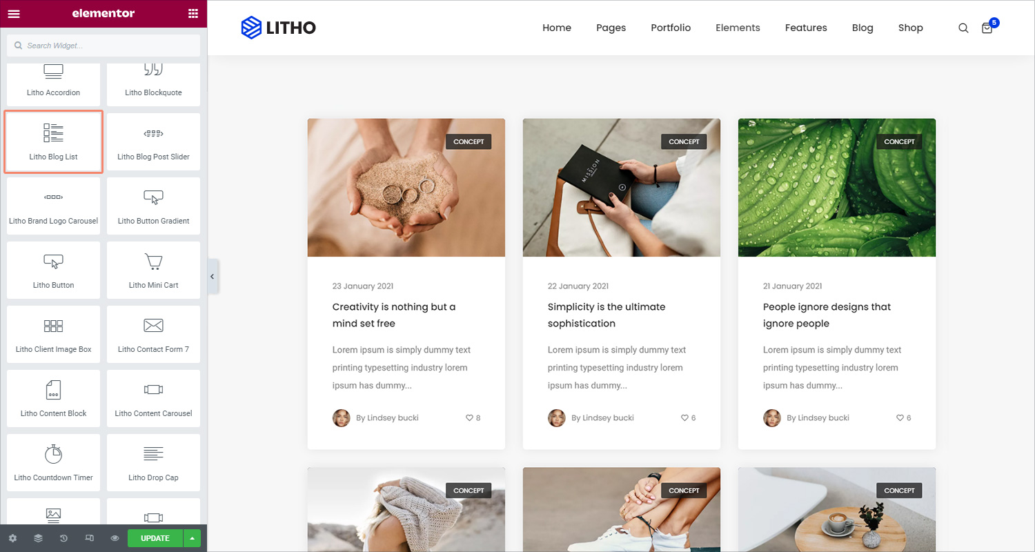
With the Litho blog list Widget, you can display a list of any blog post types, including custom post types, in various layouts and ways.
This widget can be used to display posts from a particular category or other taxonomy, recent posts, and more.
Content
General
| Select style | Choose from different available styles |
| Source | Select the source from which the widget will display the content |
| Type of selection | Choose the content selection type from categories & tags |
| Categories/tags | Add different categories & tags respectively after selecting content selection type |
| No. of column | Add no. of column for the content |
| Columns gap | Set column gap between no. of the columns |
| Ignore sticky posts | Mark yes/no to ignore sticky posts |
| Number of posts to show | Set the number of posts to show on the blog list widget |
| Post title | Mark yes/no to display the post title |
| Post thumbnail | Mark yes/no to display post thumbnail |
| Size | Choose from different sizes of the blog list widget |
| Post featured image only | If off is selected, it will display blocks as per post format type like audio, video, gallery, etc… otherwise, it will show post featured images no matter what is post format type |
| Post type icon | Click yes to display the post type icon |
| Post author | Click yes to display the post author |
| Post author image | Mark “Yes” to add a post-author image |
| Post author text | Add post author text in the blank area |
| Post date | Mark “Yes” to showcase post date on the blog list widget |
| Post date format | Add the post date format and it should be like F j, Y |
| Post excerpt | Mark “Yes” to showcase post excerpts |
| Excerpt length | Add post excerpt length using the drop-down feature |
| Read more | Mark “Yes” to add read more to the blog list widget |
| Read more text | Add text for read more button |
| Post category | Mark “Yes” to showcase the post category to the blog list widget |
| Post comments | Mark “Yes” to actively post comments on the blog list widget |
| Show comments text | Click yes to display the comment text |
| Post like | If you want to showcase the blog post total likes, enable “yes” |
| Show like text | Click yes to display the like text |
| Separator | If you want to separate blog posts then enable this option as “yes” |
| Posts order by | You can organize post order by date, ID, author, title, random, modified, etc |
| Posts sort by | You can sort posts in descending and ascending order |
| Entrance animation | You can apply different animation effects for the blog post entrance |
Filter
| Enable filter | Click on “Yes” if you want to enable a filter for blog posts |
| Type of selection | Choose the content selection type from categories & tags |
| Categories/tags | Add different categories & tags respectively after selecting content selection type |
| Select default categories/tags selected | After adding categories or tags, select the default categories or tags |
| Order by | Set the order in which the posts will be displayed. Options include ID, Name, Slug, or Count |
| Sort by | You can sort filters in descending & ascending order |
| Show all text filter | Mark “yes” to show all text filters |
| All filter label | Add text to showcase “all” filter labels |
Pagination
| Pagination | Choose how you wish to paginate the results. Options include None, Numbers, Previous/Next, infinite scroll, and load more |
Style
General
| Alignment | Set the alignment of the content in the widget as left, center, or right |
| Background type | Set the background type from the classic & gradient |
| Box shadow | Choose Yes to apply a pre-defined box shadow |
| Border type | Set the border type of the content from solid, double, dotted, dashed, and groove |
| Border radius | Set the roundness of the border corners of the content |
| Padding | Set the padding around the blog list |
| Margin | Set the margin around the blog list |
Filter
| Background type | Set the background type from the classic & gradient |
| Alignment | Set the alignment of the content in the widget as left, center, or right |
| Border type | Set the border type of the filter from solid, double, dotted, dashed, and groove |
| Border radius | Set the roundness of the border corners of the filter |
| Padding | Set the padding for filter |
| Margin | Set the margin for filter |
| Box shadow | Choose Yes to apply a pre-defined box shadow |
| Typography (Filter items) | Set the typography options for the filter items |
| Color (Filter items) | Choose the color type for the filter items |
| Background type (Filter items) | Set the background type from the classic & gradient |
| Border type (Filter items) | Set the border type of the filter items from solid, double, dotted, dashed, and groove |
| Border radius (Filter items) | Set the roundness of the border corners of the filter items |
| Padding (Filter items) | Set the padding for filter items |
| Margin (Filter items) | Set the margin for filter items |
| Box shadow (Filter items) | Choose Yes to apply a pre-defined box shadow |
Post thumbnail
| Border type | Choose the border type for the post thumbnail from solid, double, dotted, dashed, and groove |
| Border radius | Set the roundness of the border corners of the blog list |
| Overlay | Set the overlay for the post thumbnail from normal or hover |
| Opacity | Set the opacity for the post thumbnail using the scrolling feature |
| Background type | Set the background type for the post thumbnail from the classic and gradient |
Post Type Icon
| Color type | Choose the color type for the post type icon |
| Background type | Set the background type for the post icon from the classic and gradient |
| Box shadow | Choose Yes to apply a pre-defined box shadow |
Post title
| Typography | Set the typography options for the post title |
| Color | Choose the color for the post titles |
| Width | Set the width for the post title |
| Min height | Set the minimum height for the post title |
| Padding | Set the padding around the post title |
| Margin | Set the margin around the post title |
Post Content
| Color | Choose the color of the post content |
| Typography | Set the typography options for the post content |
| Content width | Set the content width for the post content |
| Padding | Set the padding for the post content |
| Margin | Set the margin for the post content |
Read More
| Width | Set the padding for read more button |
| Height | Set the height for read more button |
| Typography | Set the typography options for read more button |
| Color type | Choose the color for read more text |
| Background type | Choose the background color for read more button |
| Border type (Border) | Choose the border type for the read more button from solid, double, dotted, dashed, and groove |
| Border radius (Border) | Set the radius for the border-top, right, bottom, and left |
| Box shadow (Border) | Choose Yes to apply a pre-defined box shadow |
| Padding (Border) | Set the padding for read more button |
| Margin (Border) | Set the margin for read more button |
Post Meta
Post Meta Category
| Typography | Set the typography options for the post meta category |
| Background color | Set the background color for the post meta category |
| Color type | Choose the color type for the post meta category |
| Border type | Choose the border type for the post meta category from solid, double, dotted, dashed, and groove |
| Border radius | Set the radius for the border-top, right, bottom, and left |
Post Meta Date
| Typography | Set the typography options for the post meta date |
| Color | Set the color for the post meta date |
| Margin | Set the margin for the post meta date |
Post Meta Author
| Typography | Set the typography options for the post meta author |
| Color type | Set the color type for the post meta author |
| Margin | Set the margin for the post meta author |
Post Meta Like
| Typography | Set the typography options for the post meta like |
| Color | Set the color type for the post meta like |
Post Meta Comment
| Typography | Set the typography options for the post meta comment |
| Color | Set the color type for the post meta comment |
Separator
| Color | Choose the separator color from the classic and gradient |
| Separator thickness | Set the thickness for the separator |
| Separator length | Set the length for the separator |
| Separator spacing | Set the spacing for the separator |
Advanced
Click here to set the advanced options that are applied to this widget.