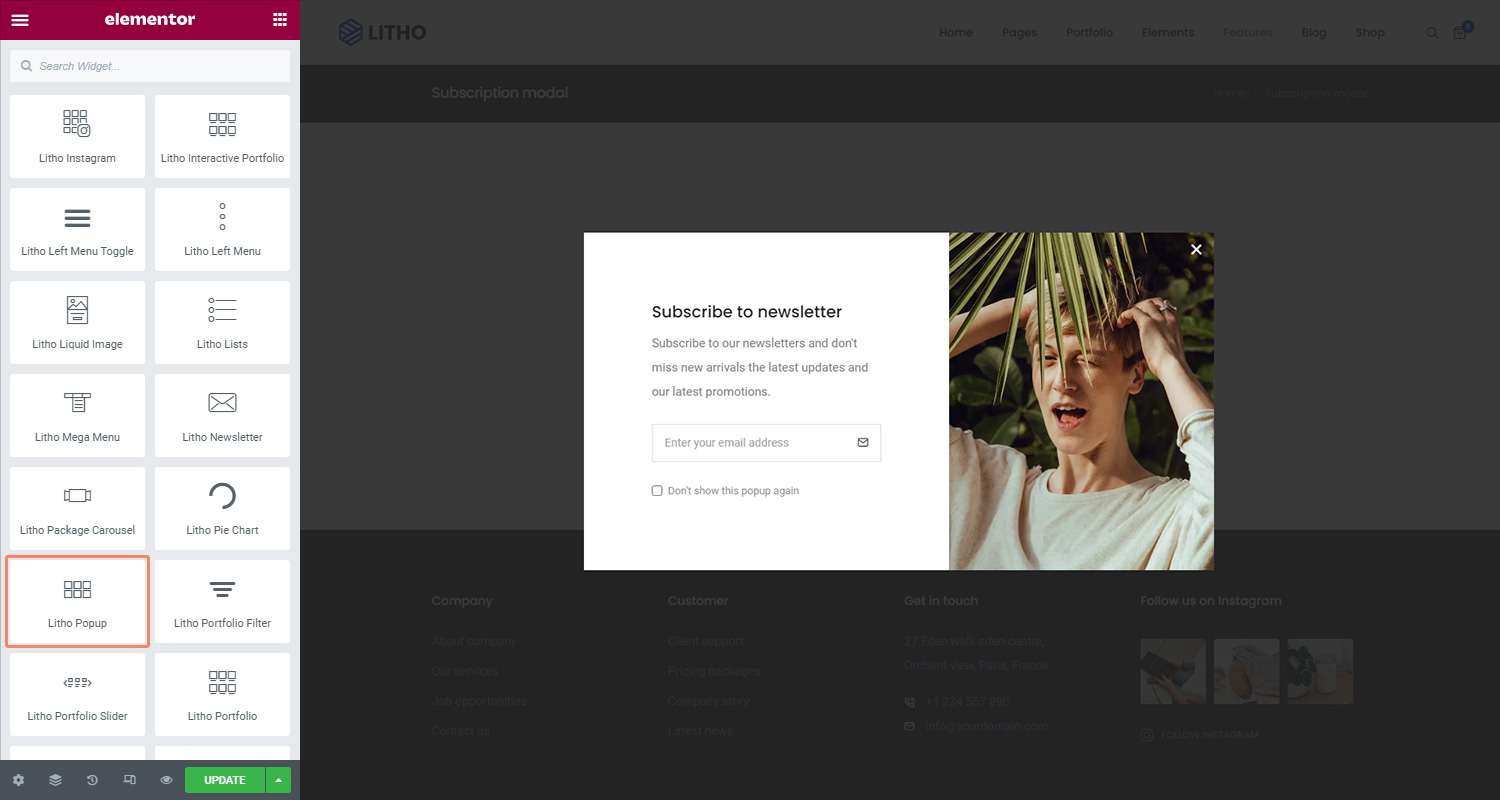
Content
Popup
| Select style | Select the style for the popup |
Content
| Title | Add a title in the blank area |
| Content | Add text, visuals, and media in the blank area |
| Dismiss text | Use this to dismiss text |
Button
| Button text | Add text in the blank space |
| Size | Set the size for the button |
| Icon | Choose or upload an icon for the button from the library |
| Icon position | Set the position of icon as before or after |
Style
Title
| Typography | Set the typography for the title |
| Color | Set the color for the title |
| Spacing | Adjust the space for the title |
Content
| Typography | Set the typography for the content |
| Color | Set the color for the content |
| Spacing | Adjust the space for the content |
Dismiss Button
| Typography | Set the typography for the dismiss button |
| Color | Set the color for the dismiss button |
| Background type | Set the background type for the button |
| Border type | Set the border type for the button |
| Border radius | Set the border radius for the button |
| Padding | Set the padding for the button |
| Box shadow | Set the shadow for the button |
Button
| Typography | Set the typography for the dismiss button |
| Color | Set the color for the dismiss button |
| Background type | Set the background type for the button |
| Border type | Set the border type for the button |
| Border radius | Set the border radius for the button |
| Padding | Set the padding for the button |
| Margin | Set the margin for the button |
| Box shadow | Set the shadow for the button |
Lightbox
| Alignment | Set the alignment of the lightbox |
| Width | Set the width of the lightbox |
| Close button color | Set the close button color |
| Close button hover color | Set the close button hover color for the lightbox |
| Background color | Set the background color |
| Border radius | Set the border radius |
| Padding | Set the padding for the lightbox |
| Animation | Choose the animation effect for the lightbox |
Advanced
Click here to set the advanced options that are applied