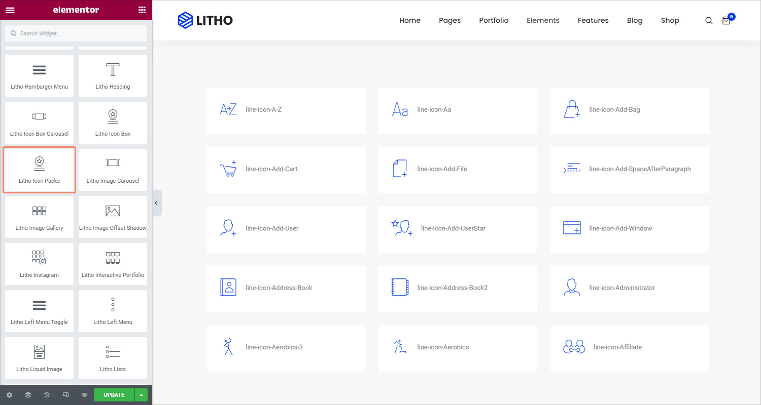
The Litho Icon Packs Widget creates an easy-to-manage list of items, with each item highlighted by its own icon.
Content
General
| Select icons library | Choose icon library using dropdown menu |
Settings
| No. of column | Set the total number of columns in icon packs |
| Columns gap | Define the gap between columns |
Style
General
| Background type | Choose the background as a classic or gradient |
| Box shadow | Set the shadow for the box |
| Border type | Set a border to the entire box |
| Border radius | Set the border radius for the box |
| Padding | Set the amount of padding |
| Margin | Set the margin for the feature box |
Icon
| Color type | Set the color type as a solid or gradient for the icon |
| Size | Set the icon size |
| Spacing | The space between the icon and the heading |
| Rotate | Rotate the icon |
| Hover animation | Choose from a long list of animations for the hover |
Icon Text
| Typography | Set the typography for the icon text |
| Color | Set the color for the icon text |
Advanced
Click here to set the advanced options that are applied to this widget.