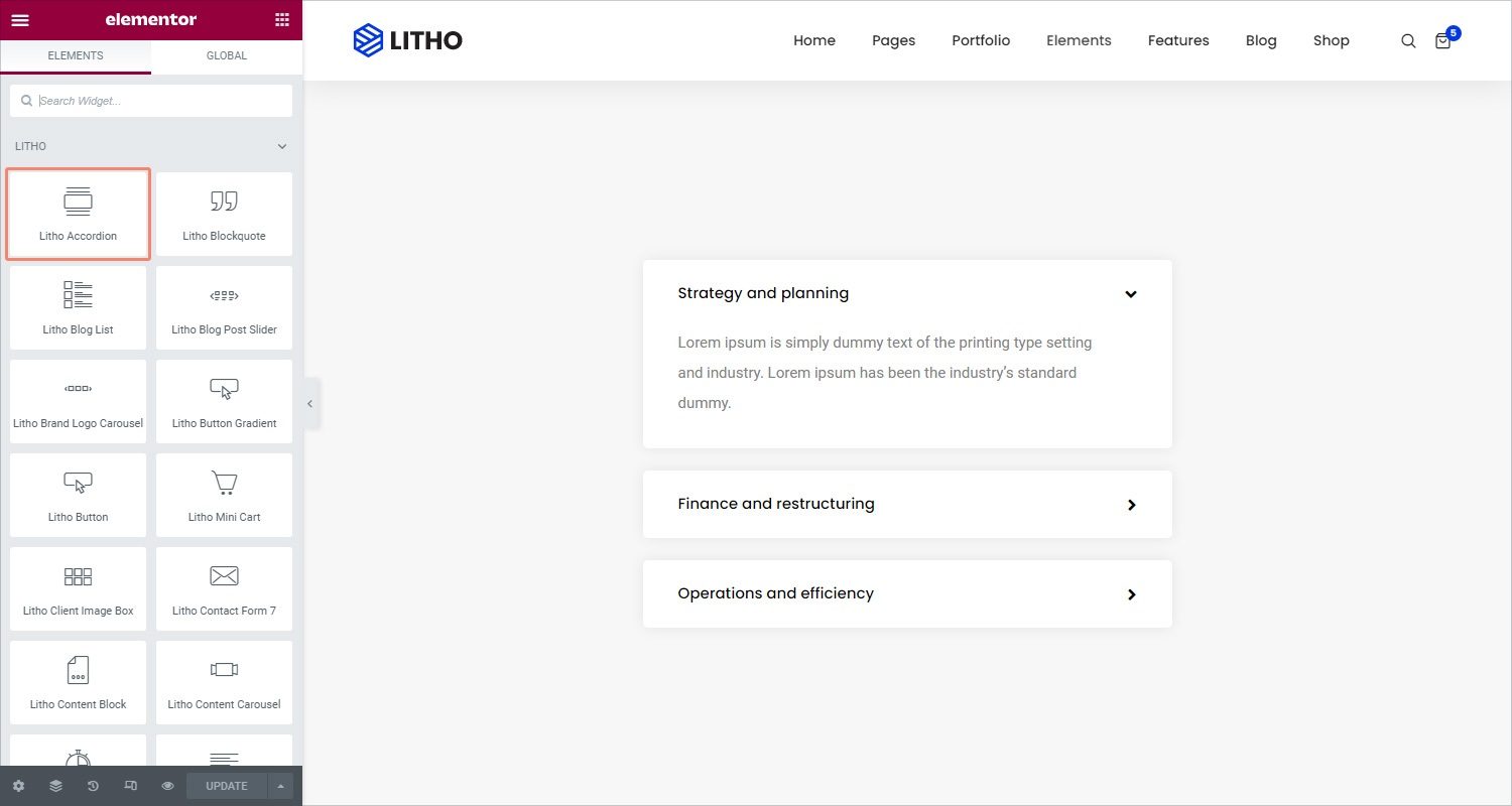
The Litho Accordion Widget is used to display text in a collapsed, condensed manner, letting you save space while still presenting an abundance of content.
With the Accordion, visitors can scan the item titles and expand an item only if it is of interest.
Content
General
Select style
Choose from different available styles
Enable default active
Click on “Yes” to enable default active
Accordion
Accordion items
Use the ‘Add Item’ button to add more accordion items to the list
Icon
Select the icon to represent the action of expanding an item. Choose either None, Upload SVG, or select an icon from the Icon Library. If Icon Library is chosen, a Recommended tab is shown in the Library which shows recommended icons to represent the expanding concept
Active icon
Select the icon to represent the action of collapsing the active item. Choose either None, Upload SVG, or select an icon from the Icon Library. If Icon Library is chosen, a Recommended tab is shown in the Library which shows recommended icons to represent the collapsing concept
Title HTML tag
Set the HTML tag used for the title to H1- H6 or DIV
Style
Accordion
Background
Choose the color of the accordion background
Padding
Set the padding for accordion
Margin
Set the margin for accordion
Border radius
Set the border radius around the accordion
Box shadow
Set the box shadow of the accordion
Title
Typography
Set the typography options for the titles
Color
Choose the color for the title text
Border type
Choose the border type for the titles from solid, double, dotted, dashed, and groove
Padding
Set the padding for the titles
Icon
Alignment
Align the icon from the start to end of the title
Color
Choose the color of the icons
Size
Set the icon size
Spacing
Control the spacing between the icon and the title
Icon top spacing
Control the icon top spacing between the icon and the title
Active icon color
Choose the color of the active icon
Active icon top spacing
Control the active icon top spacing between the icon and the title
Description
Color
Choose the background color of the description
Typography
Set the typography options for the description
Border type
Set the border type for the description
Padding
Set the padding for the description
Margin
Set the margin for the description
Advanced
Click here to set the advanced options that are applied to this widget.