Content
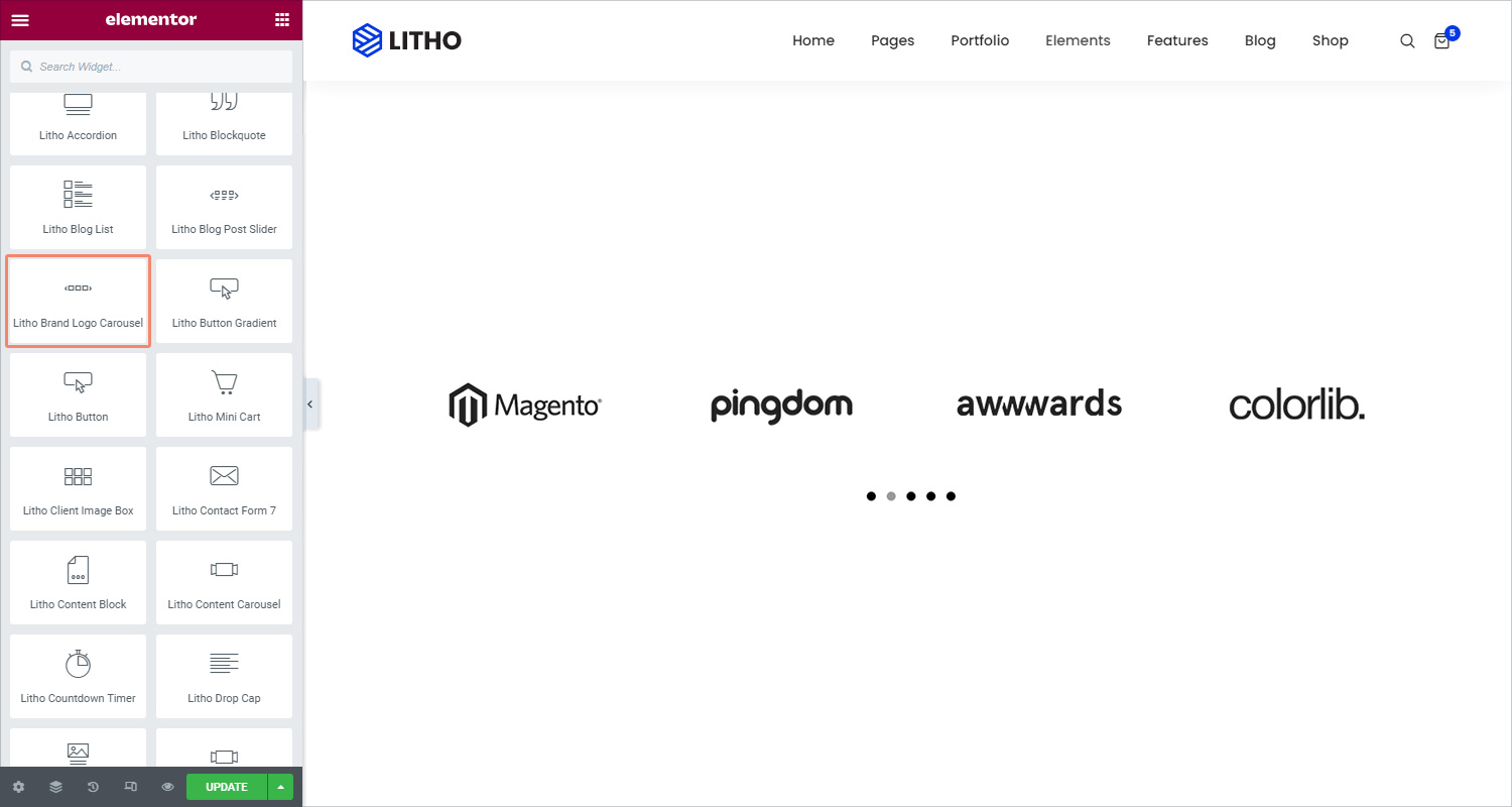
Slider
| Carousel items | Add required carousel items in the slider |
Slider Configuration
| Image size | Choose the size of the image, from thumbnail to full |
| Item spacing | Set the spacing between the image and the content |
| Slides to show | Select the number of slides to show at one time, from 1 to 10 |
| Image stretch | Check “yes” if you want to stretch the image |
| Navigation | Set the navigation for the slider as dots and arrows |
| Pause on hover | Check “yes” to add pause effect hover |
| Autoplay | Check “yes” to show autoplay on the slider |
| Autoplay speed | Set the time between each slide. This time is in milliseconds, so 1000 ms is equal to 1 second |
| Infinite loop | Show the carousel in a continuous loop, infinitely. Yes or No |
| Animation speed | Set the time it takes for the animation speed to appear |
| RTL | Set the slider direction from right to left |
| Cursor | Set the cursor visuals as black, white, or default |
Style
Image
| Opacity (Normal/Hover) | Set the image opacity for Normal and hover using the scrolling feature |
Navigation
Dots Style
| Position | Place pagination outside or inside of slides |
| Spacing | Set the spacing between the image and the content |
| Size | Set the size of dots using the scrolling feature |
| Color | Set the color for dots |
| Border type | Set the border type from the solid, none, double, dotted, dashed, and groove |
| Margin | Set the margin for the dots |
Advanced
Click here to set the advanced options that are applied to this widget.