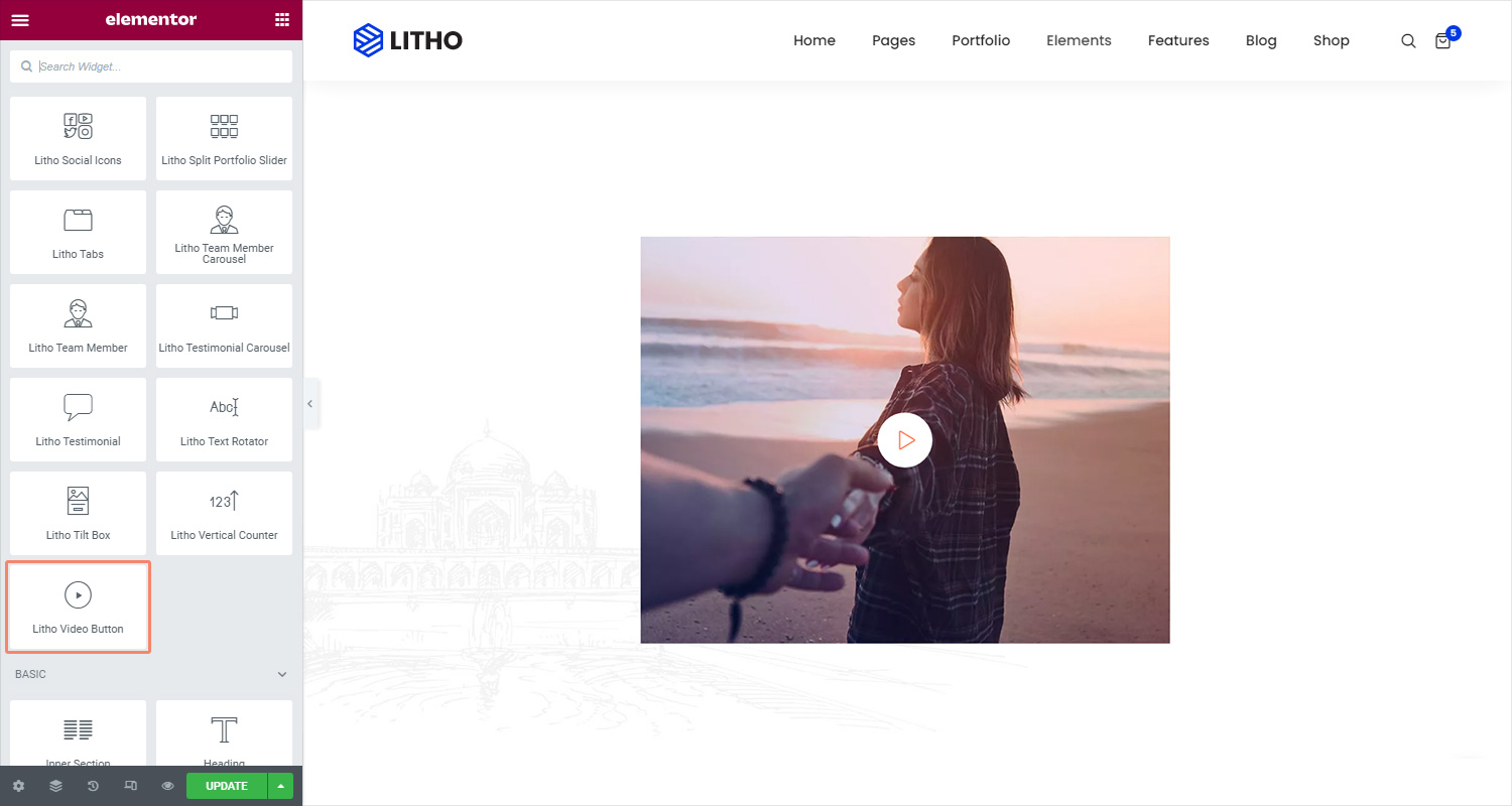
Content
Image
| Select style | Choose different styles for the image |
| Use image? | Click on the “yes” to add the image |
| Icon/Image | Set icon image from the library |
| Image size | Set the size of the image from the available using drop-down function |
Content
| Title | Add a title for the content |
| Video URL | Add relevant video URL in the blank space |
Settings
| Enable button | Click on the “show” to enable the button |
| Enable animation | Click on the “yes” to enable the animation |
| Alignment | Set the alignment for the button |
Style
General(Normal/Hover)
| Close button color | Set the close button color |
| Close button hover color | Set the close button hover color |
| Size | Set the size for the button |
| Icon box size | Set the icon box size for the button |
| Icon color | Set the icon color for the button |
| Background type | Set the background type for the button |
| Margin | Set the margin for the button |
| Box shadow | Set the box shadow for the button |
| Icon margin | Set the icon margin for the button |
Primary Title(Normal/Hover)
| Typography | Set the typography for the primary title |
| Color | Set the color for the primary title |
| Border type | Set the border type for the primary title |
| Padding | Set the padding for the primary title |
Advanced
Click here to set the advanced options that are applied to this widget.